There’s a great little story about how on the set of E.T., Spielberg slowly unwrapped a toy off camera to illicit a reaction from the young actor playing Elliott. I’ve always thought this story was a great way to explain how a filmmaker should approach exposition. Exposition is the easiest, most fun, and most misunderstood part of storytelling. But filmic exposition is generally stupid, because people are afraid of it.
Somebody once asked me, about my 50/50 Rule, “When making a movie, would you pay extra special attention to how it starts, since you lose interest in so many movies so fast?” The answer is decidedly no, because every frame of a movie is sacred and equally important. If you treat your entire movie like that, then you don’t need to spend extra attention to any one part of it. Exposition is too often just underestimated as something that has to be blown through in order to get to the fun stuff. To counteract this, the indies have bloated their exposition with way too much visual minutiae. You can build a ‘stark’, ‘oblique’, ‘atmospheric’ world with your story—you don’t need shots that hold too long on a girl as she wistfully puts on makeup.
Jurassic Park is my favorite exercise in exposition, and in a way, the entire movie is exposition.
Jurassic Park is basically the best movie ever made about an insurance inspection. And by not taking place at the grand opening of the titular park, the writers are able to focus on the relationships of a few select characters, without the clutter of a sea of nameless, running people. It’s also the best way to slowly reveal the real heroes and villains: the dinosaurs. We learn which dinosaurs are harmless, like the huge Brontosaurus that eats some leaves right next to our main characters, and which are scary, like the Raptors that maul a cow to pieces hidden behind bustling foliage. The character’s individual reactions to these scenes accomplish two things at once—it builds their relationships with each other (and therefore the audience) and it telegraphs the thrills found later in the story. It’s all very formulaic and common, but what Jurassic Park proves is that old tricks are effective when executed with earnest craft.
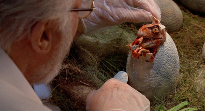
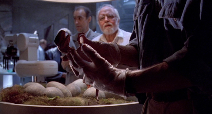
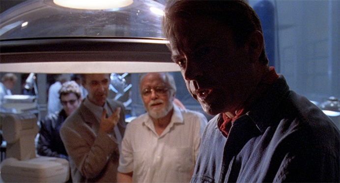
We are actually introduced to the Raptor twice—once during feeding, and again while behind born. The baby raptor looks incredibly cute bathed in the warm light of its robot arm hatching bin or whatever—but then, as Dr. Grant holds it, he becomes silhouetted. Cloaked in darkness, he asks what species it is. The tone shifts—raptors are scary, and the lighting suggests that:


The purely expository scenes in Jurassic Park are some of its best, because the characters have an intelligent yet bizarre familiarity—the actors flourish inside their characters. It’s the stuff Spielberg does best: the overlapping dialogue and action; the hectic hustle-bustle of human reality, staged like a ballet amidst his trademark camera movements. There is a beautiful sense of movement to the first half of Jurassic Park. It’s exotic and alluring, and it brings you inside the experience.
In movies like The Dark Knight or Transformers, exposition is staged with a boring coverage scene where the movie suddenly gets quieter after the explosion-ridden opening reel. I’m all for formulaic structure—but not homogenization. Within the confines of Hollywood homogenization, exposition is the first to become stupid because it has to be clear and direct and not miss anybody. Movies used to use exposition for fun—it used to be that somebody says something badass, or funny, and then we’d cut to the adventure. Nowadays, boring expository scenes are dragged out through matching closeups until the next head gets blown off.
Again, I’m thinking about The Dark Knight. The Dark Knight had me for about ninety seconds. Bill Fichner yells “Get out of my bank!” and grabs a shotgun and everything seems pretty badass. But then the heist is over, they drive away, and we are plopped into boring dialogue. The next memorable scene is the one where The Joker comes in to talk to all those bad guys and he kills the dude by balancing a pencil on the table and smashing a dude’s head on it. That scene is memorable because there is a real tension created by the mania of The Joker as compared to more traditional bad guys. It punctuates act one, and ideally we are supposed to be led swiftly into act two where Batman must deal with this cat and mouse game he’s about to be in—instead, we’re just given exposition about other, way less satisfying subplots.
My three favorite expository sequences of all time are in the three best movies ever made. (Go figure.) The first is the ever-intricate, ever-intriguing, awe-inspiring, career-starting first shot of Back To The Future. The whole character is in that shot, along with tons of other useful info about the plot. A lens-flaring guitar pick, a tiny guitar, a teenager who’s best friends with an actual mad scientist—it gets you to believe all of this stuff at face value, and it does it so quickly that it looks effortless.
Next is Signs—the entire movie. Signs unravels with comfortable, exquisite care. It begins with a medley of its score that cheesily ramps up, over even cheesier titles, which fly at you with cross-zooms. When the movie begins, you start to understand why—each beat builds upon the last. Signs dispenses information in a very calculated way that serves the creator’s story. To be inside Signs is to be inside Shyamalan’s hands, and to be guided by the sublime.
Information is a priceless commodity in a story. Every frame, every choice of color, every choice of light, every piece of wardrobe, every line, every delivery, every camera movement, every special effect, is a tiny bite of information that gets dispensed, continuously, to the audience—it’s why continuity errors are distracting, and why we have entire departments dedicated to this stuff. Signs knows exactly what color to use, at what time, with what camera movement, timed with what action, etcetera, at every beat. It is cinematic storytelling at the highest and most advanced level.
But, my most favoritest exposition of all time is the first twelve minutes of Raising Arizona. With Raising Arizona, the Coen’s were tapped into whatever force in the universe governs the poetic ear for storytelling. Every shot is poetry, as is every twinge of 23-year-old Nicolas Cage’s bizarre southern accent.
Hi is pushed into the frame, centered, in front of a prison-white background. In voiceover, he starts telling his story by introducing himself. “My name is H.I. McDonnough.” Thus begins the most pointedly-perfect 12 minutes of cinema. Over the course of the sequence, Hi takes you through his life, but not just his life—all of life itself.
The film may well have been a creature-clad story by Aesop, Seuss, or the like. Raising Arizona is about a person’s station in life, about their ability to understand how to reconcile their nature within their station. Hi is a lab rat in a mad scientist’s experiment. What obstacles can we place in front of the rat? What resilience lies in the human heart?
Each of these examples handle exposition in a completely different way. Raising Arizona is similar to Citizen Kane and Titanic wherein the entire story is told to the audience directly. Nobody remembers this, but in Titanic, that fat beard guy character tells everyone in the room exactly how the ship sinks. (Ebert and I have both noted that this was a clever way to sew up the fact of, yes, we are using the actual story, and yes, we admit you already know what happens, but yes, you will learn something, because what you just saw was super-badass and cool.)
Really it all comes down to the fact that, exposition is a necessary part of your movie, so why not make it as good as everything else in the fucking movie? Being brazenly boring about it is literally admitting that you don’t know enough about filmmaking and storytelling and art to care to try and make these scenes work. Sure you can stage a big opening scene with a seven-explosion photogrammetry shot, but can you make me believe that the characters talking afterwards actually know each other and have a relationship? It’s the latter that really matters, and what elevates movies such as Indiana Jones, The ‘Burbs, and Big to the upper echelon of filmmaking, and reduces stylistic jazz-art like Raging Bull to the level of shallow-yet-attractive curiosity.
Wow, you hit the nail exactly on the head with this piece. Exposition always works better when told in an atmospheric manner that doesn’t compromise the plot of the movie. I’m glad you mentioned The Dark Knight because this is always something I found flawed about Nolan’s work which the Nolanites seem to crazily be oblique to. Yes, it is BORING to have entire sections of film dedicated to overly-written pieces of verbal exposition, and ultimately destroys the pacing of a film, (and in Nolan’s case seems to be a display of trying to act smart through his psudo-intellectual mumbo-jumbo.) It’s ridiculous when fans of his and other exposition-heavy directors try to use how much exposition they memorized as some sort of indicator that they are better at film crtisism than others, which couldn’t be further from the truth. Thank You again for the article, really enjoyed it.