Alfred Hitchcock was not just one of the great stylists of the film world, but also one of its great fonts as well, with 53 feature films and a score of TV works, in just about every pre-modern format imaginable, from tinted silent black-and-white to special effects-soaked technicolor. I thought it’d be fun to take a look at some of the moments in his work that really click for me. So, here’s my very personal and by no means exhaustive list of my favorite Hitchcock shots:
The 39 Steps (1935)
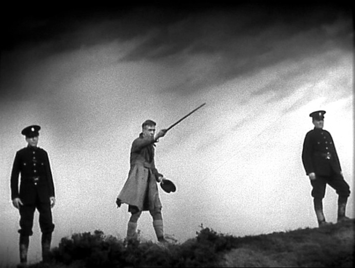
Hitchcock started his film career as a title card designer. Maybe that background in graphic design is where he developed his eye for framing such crisp, clear, instantly readable shots. This frame is a whole story in a single second, a paranoid masterpiece using the starkness of both the Scottish countryside and high contrast black-and-white to its advantage. It could be an etching in a Dickens book.
The Wrong Man (1956)
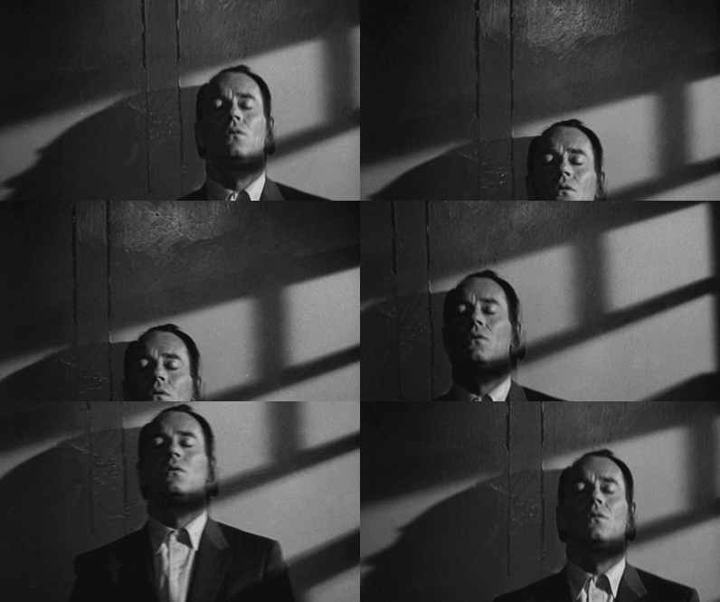
The Wrong Man, with its true-life story, real locations, and proto-Law & Order feel, was a big departure for Hitchcock—and also makes it almost cartoonishly up my alley. Within its gritty, street photography-inspired imagery, this single burst of expressionism really jumps out. His greatest evocation of a state of mind, it’s a beautifully stark, Dreyer-esque image—the face of a man realizing he has just lost everything.
Vertigo (1958)
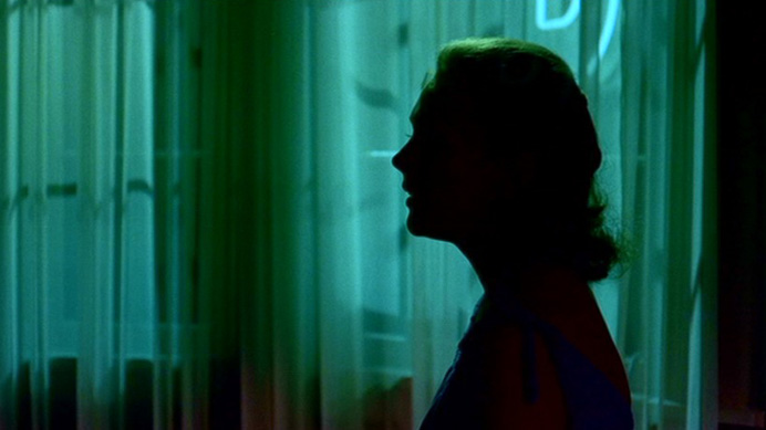
Anchoring a totally surreal lightscape with a practical source, so that unlike the cutouts and spirals which haven’t aged terribly well, this simple close up still retains the sinister aura of something fundamentally amiss, expanding on the more subtle red and green splashes in the last reel of Rope.
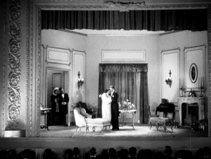
Murder! (1930)
This is like something Lubitsch would do. We pull out during the final happy coda to see that it’s all on stage, our leading lady (who is a member of a theater company) and leading man embrace just before the curtain closes. The same sort of wink to the audience that ends North by Northwest, it’s an uncommonly sweet, imaginative last beat that elevates a middling film.
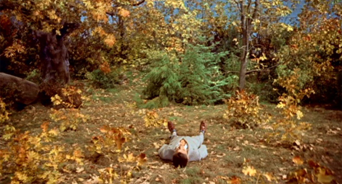
The Trouble with Harry (1955)
This is how Rockwell would’ve painted death. There’s something so droll about the combination of crisp New England lushness and a perfectly composed dead man laying stock still like a punctuation mark on the screen. Hitchcock had a knack for leering with class—the formalism of Harry here, arms at his side, suit all together, adds some levity and gives it a nice twist of absurdity.
The Birds (1962)
Those images of numberless crows on playground equipment still have impact, but their gothic edge links them pretty heavily to the past—rather, it’s here that for the first time, the apocalypse of overwhelming numbers (never properly seen on film before The Birds) fully ripens. For the first time we see the world from the birds’ point of view. Their numbers endless, their sound deafening, we see ourselves as ants, the huge fire just a little scar on a remote landscape. One could argue that The Birds is the first truly modern horror film, and that this shot is its great leap forward.
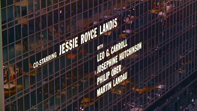
North by Northwest (1955)
So much is visionary in North by Northwest, a 1955 film that basically anticipated every aspect of the 1960s visual style. It’s been called the first James Bond movie for its spy-thriller plot and modernist style, and in a lot of ways it’s also the first Mad Men episode—the story of a drunk ad man operating under a fake name. I could go on. But it’s the opening credits that really changed the game. Heralding the coming decade’s obsession with precise delicate line work, designer Saul Bass and Hitchcock (always game to try new effect techniques) utilize both kinetic typography and integrated titles for the first time in film history, and wrap it all up with this fade so precise and beautiful that it’s still hard to believe it wasn’t done with computers. The kind of titling in everything from Game of Thrones to Fight Club began here.
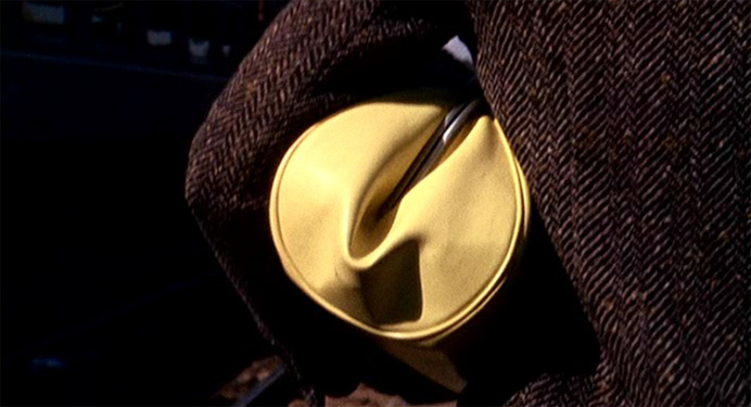
Marnie (1964)
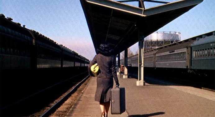
First shot of the film and without a word, we already know something’s amiss. There are so many surrogate penises in the film world, it’s almost refreshing to see such an unabashed feminine symbol as this woman in black carrying a glowing vagina full of stolen money, coolly leaving us behind.
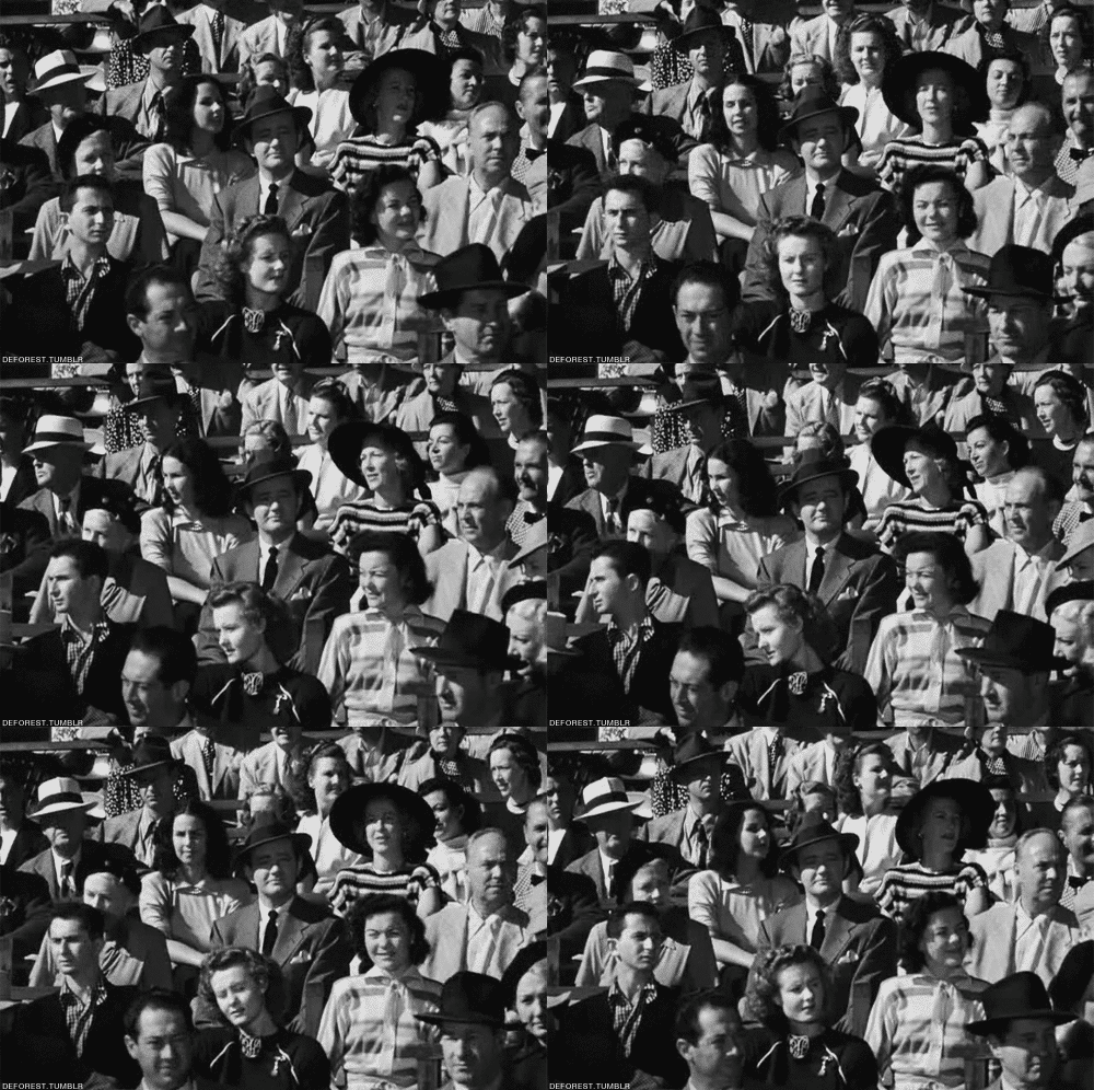
Strangers on a Train (1951)
Hitchcock was the master of subtly breaking the 4th wall, sometimes to chilling effect, sometimes for great comedy. Here, his masterpiece shot of that particular subgenre, manages both at the same time. It’s almost unbearably tense (Bruno’s gaze puts us on the spot too) and sort of droll at the same time—hell, the same effect was used as a pure gag in Chaplin’s The King in New York. The best Hitchcock stuff is often nightmarishly absurd, and here’s the epitome of that kind of funny/scary imagery that separated the man from the pack, and it’s exactly what people mean when they say ‘Hitchcockian’.
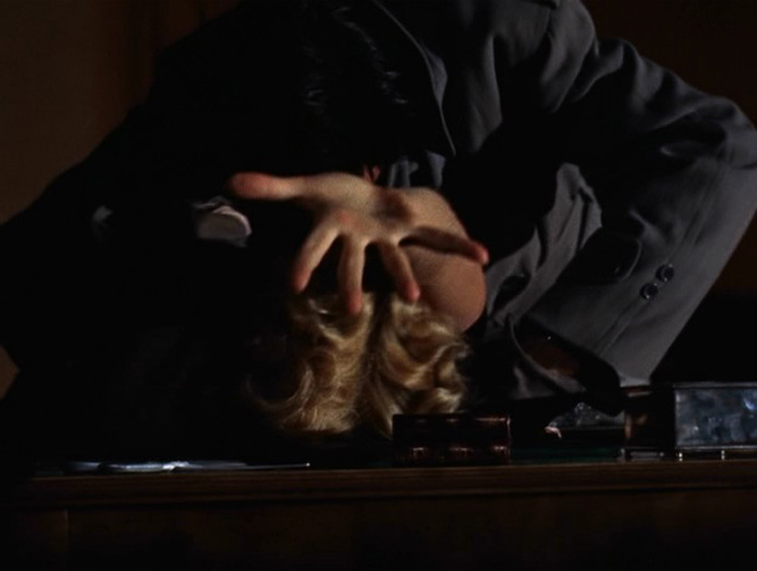
Dial M for Murder (1955)
Hitchcock did 3D exactly once, and though nobody’d call it his best, he makes it through better than you might expect. The gimmick weirdly played to his strengths. For his whole career, he experimented with aggressive contact with the audience, from that Strangers on a Train shot above to his cameos. He liked to blur the lines, to push us, to test our will and moral compass, and never was he more aggressive than this shot of the beloved Grace Kelly reaching out to us. Not up, not to the side, but directly towards us, breaking through the screen itself just like every 3D demo promising images that will pop through the screen. It’s like he’s (as he so often did) rubbing the violence in our face, asking us ‘is this what you wanted’? It’s like Funny Games in 1/100th the time. You can practically hear him pluck the strings.
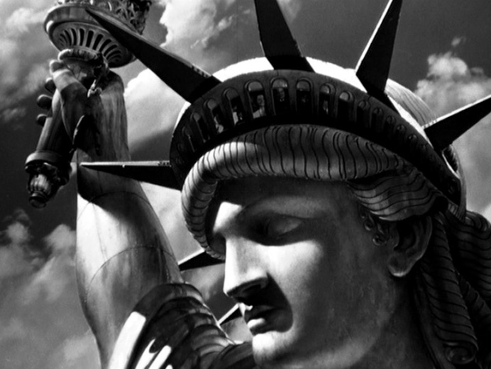
Saboteur (1942)
Okay, right off the bat, it takes some balls to end your wartime propaganda movie with the villain falling off the Statue of Liberty. The Mt. Rushmore version of this shot is certainly more iconic and the British Museum version probably lends itself better to being a still, but this here is Hitchcock as I love him most: insanely ambitious and blazingly symbolic. It’s the grand imagery of a Michael Bay film meeting the absurdity of a Looney Tunes short. The epitome of ‘man on the run’—his first great plot structure—we watch a normal guy as things escalate step-by-step until he’s in the biggest, strangest, splashiest trouble of his life. The sadistic crosscutting to the sleeve of his jacket ever so slowly ripping open is just icing on the cake. Ever wonder if Hitchcock emigrated to America just for our landmarks?
Frenzy (1972)
Hitchcock was out of fashion in 1972. The New Wave of cinema had taken root worldwide. Filmmakers were showing death and sex with explicit realism for the first time, and audiences were very interested in exploring those lost arts. So by the time Frenzy rolled around, nobody was quite interested in the implications and suggestions that the man built his career on. The movie is very deliberately his only shot at a modern serial killer movie, and it’s better than you’d expect. Hitchcock was never one to shy from new techniques, and he adapted pretty well to showing the gory details, but ironically, the film’s strongest moment would’ve been right at home in Blackmail in 1929.
The camera follows our heroine upstairs to the (unbeknownst to her) killer’s apartment, and then just slowly, silently, drifts down to the street. The quiet finality and helplessness of it hit as hard as any moment of the master’s career. To cap it all: a near-seamless match cut as we pass through the doorway finally nails a technical problem he’d been struggling with since Rope. Truly powerful filmmaking.
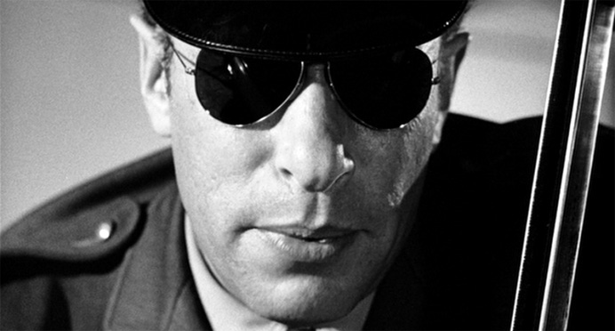
Psycho (1960)
How do you pick a favorite frame from Psycho, a movie so overwhelmingly stuffed with implication and suggestion that it seems like just about every shot is foreshadowing something or reminding you of something it foreshadowed. Psycho might be the most structurally sophisticated film ever made. And there are a lot of contenders for best shot, from the slashing wiper blades to the simple menace of Vera Miles surrounded by rakes, but the image from Psycho that always jumps out at me is this shot of a police officer, long acknowledged as Hitchcock’s deepest fear. Eight years before Cool Hand Luke, Hitchcock nailed the creepiness of mirrored sunglasses—on this gaunt frame they turn the man’s face into a death’s head skull, highlighting Marion’s panic and anticipating that final fright of Mother’s body in the cellar, without ever overplaying his hand.
(Many of these shots from the fabulous site 1000 Frames of Hitchcock)