She (Orig. 1935, Colorized Version 2008)
Colorization is one of those things that people call “controversial”, and like most glib descriptors, it’s a kind of shoddy definition. There’s no controversy over colorizing things. People hate it. Everybody hates it.
The people who care about movies hate it because it paints over esteemed favorites, dolloping them in eerie flesh tones and smeared, lifeless color like a little girl trying out one of those toy makeup kits. Meanwhile, they fail to catch any new blood because those who hate black and white movies don’t just hate black and white movies because they’re in black and white, and a bit of clown makeup will never bridge that psychological distance.
Take a look at the advertising techniques of Legend Films, about the only company still colorizing films. In the course of a half-decade or so they’ve gone from “NOW IN COLOR FOR THE FIRST TIME!” to “NOW IN COLOR WITH DIGITALLY RESTORED BLACK AND WHITE!” to “DIGITALLY RESTORED BLACK AND WHITE WITH RIFFTRAX COMMENTARY AND ALTERNATE COLOR VERSION!” I hear they’re branching out into 3D instead. There’s just no market space for colorization.
About the only person I know who actually likes colorized films is my mother, and even in that case it’s only one film: Casablanca. Her favorite. She’s watched Casablanca at least once a year since she was a little girl, and about once every five years or so she drags out her beat up ripped-from-VHS copy of the Ted Turner colorization. It’s a tawdry little spectacle. It has the same effect as those new TVs with that MotionFlow feature—it seems to violate the very idea of the movie, dragging it out of its world and making us acutely aware of the sets and the banal humanity of it all. Smeared and garish, you lose any sense of Rick’s Café as an elegant and magical place—instead, it’s an ugly brown bar in the middle of the desert. Chatting about it with Cody the other day, he nailed the feel: “It’s like watching ‘90s TV.”
One day I asked my mother why she watches this garbage when she could sit back with the proper original again. “You don’t understand,” she told me. “She wears blue.”
I mulled over it. I watched it in color with her, then again in black and white (she always seems to go back to that one right after the color version). I started to see it. She wasn’t watching Casablanca in color. She was watching a tribute to Casablanca. She was watching the Great Movie Ride version of her favorite movie, which she’s seen over and over backwards and forwards for twice my lifetime, long enough that every now and again you need to find a way to unbalance yourself in order to approach it fresh. Maybe that’s the beauty of artificial color. It lets us look at things fresh. The Thing from Another World, a personal favorite of mine, takes on a whole different tone in color. The threat is diminished—how could it not be?—and the crackly science dialogue takes on more of the pulp opera feel of Forbidden Planet. Just check out that toxic green radar! It’s not The Thing as I know it, but it’s a hell of a strange new alternate version of it, sort of a re-contextualized Lichtenstein version.
Siskel and Ebert called colorization “Hollywood’s New Vandalism”, and they were right. It’s straight-up graffiti art. Rather than bastardized versions of the black and white originals, colorized films can be viewed as a whole different artwork literally painted over the original. We can view the process as what, maybe, it always should’ve been considered: a medium for quirky pop-art recreations of iconic cinema, along the lines of Joseph Cornell’s Rose Hobart or DJ Spooky’s Rebirth of a Nation.
King Kong is a hell of a thing in color. One of Ted Turner’s first attempts at the process (it was colorized in 1988, Turner started dipping his toes in color in ’86), it’s a total mess. Skull Island is melted into a morass of sickly greens and implausible peaches. Turner paid for color, and goddamn if he doesn’t wring every neon he can out of that film. It doesn’t look like real life and it doesn’t look like the inky fairy tale it used to. Instead, it’s a shifting kaleidoscope of eye-popping color, like something Stan Brakhage would make, or at the very least like projections on the stage behind a prog band.
http://www.youtube.com/watch?v=Jz77RxYhtoQ
The great stop-motion pioneer Ray Harryhausen teamed up with Legend Films a few years back to colorize some of his monster movies. According to him, they were only shot in black and white for budgetary reasons, so there’s no reason not to jazz ‘em up a bit. These films are… fine. Legend Films has a lighter approach than Ted Turner—they tend to favor soft pastels in an attempt to emulate the look of ‘50s color film stock. In fact, their subtlest stuff may as well still be black and white. It has the vividness of Sovcolor.
Something like 20 Million Miles to Earth probably could’ve used Ted Turner’s operatic mania. The hell with it, give us neons and eye-burning greens. Push the color to the limit.
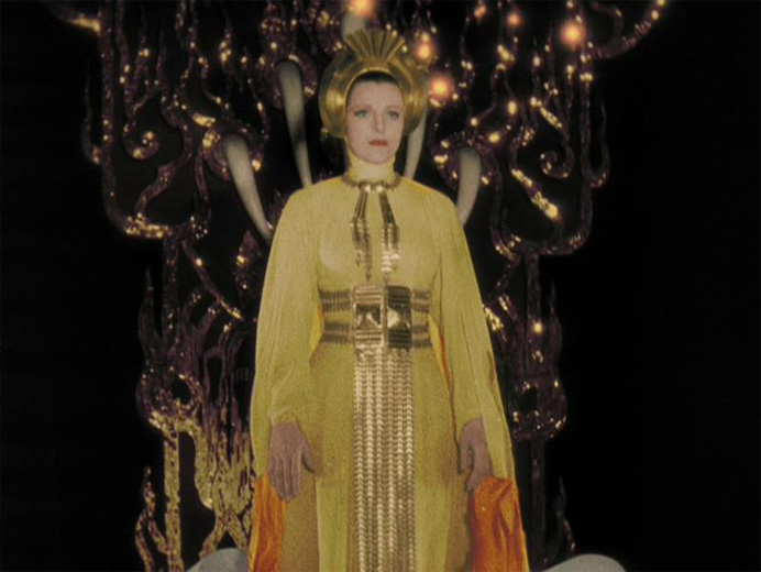
While they were working together, Harryhausen and Legend teamed up to colorize She, a kind of tedious 1935 adventure movie. This was a big tribute to its creator Merian C. Cooper, the man who created King Kong. I’ve never liked She. It has ambition, but no weight to its images. There’s great framing, and towering sets, but it just doesn’t add up somehow.
Then I tried the colorized version.
Vivid reds washed over me. Distant fires brushed the screen in moody orange. Gold, always discussed, was omnipresent. It glittered on doors, clothes, masks. The mysterious Art Deco meets Ancient Egypt society of She was simply drowning on color. And of course they were. But you simply had no idea in black and white. No idea.
For the first time I saw a colorized print as something other than kitsch, as an essential and irreducible element of seeing the film in its full grandeur. I almost hate to say it since I’ve used the opposite line so often: “Night of the Living Dead in color is pointless, the film was made for black and white.” “Casablanca looks ridiculous in color, it was made for black and white.” True in both cases. But She? She was made for color. It just never got to be seen that way until now. Watch and judge for yourself.
I fully expect to be fought tooth and nail about this, but I simply can’t imagine ever going back to seeing She in black and white again. I honestly don’t know how to feel about this.
Would you recommend watching the original B&W She first before the colorized version? I’ve never seen it (although it’s on Netflix) so it feels a little wrong to see the colorized first.
I’m of two minds about that. On one hand, I always think it’s important to see things in their best and most representative original version. But, it’s like the way you need a loud disruptive crowd for Rocky Horror, or the way a beat up VHS tape enhances a sleazy old horror movie. The colorized version of She overwrites historicity with something that better approximates the SPIRIT of what’s kind of shitty in its original version. Only in color does the adventure of it all sink in.
Fuck You!
I like them and YOU HAVE NO FUCKING RIGHT to DENY ME MY PLEASURE!
Why are most movies made in color today?
Because people want them in color.
If it were possible back then, most movies would have been made in color.
Granted the colorization of movies today has lacked quality, but that will change with technology, at least until asses like you stop it.
And, when the technology does make them in color, they will be far better than the originals.